Why do we need another Sentinel View?
For data we collect using Sentinel, we have the Sentinel View, a web page where you can find all the data in the necessary context. Being it incident statistics, geodata-related details, port scans, or real-time Dynamic Firewall updates, all is there. Question is, how do we share more complex selects, monthly data, or compare the data with the dataset regarding the exact details from another period? Our team came up with an idea for the monthly report.
The difference is on the outside and inside
The main difference from what one can see in Sentinel View is that the tables, for example, have hundreds of records instead of fifteen. The other thing, as suggested above, is that these data are on a fixed month period, and some of them are compared with the exact details from the previous month. The data from the previous month (the month before last month) cannot be magically cached, as the query for this period is based on last month’s results. Another upgrade is that we can go much more profound here, and do more intensive statistic computation here. Take into consideration the description column of the Port Trends table. We can also play a little bit with the presentation.
Report itself
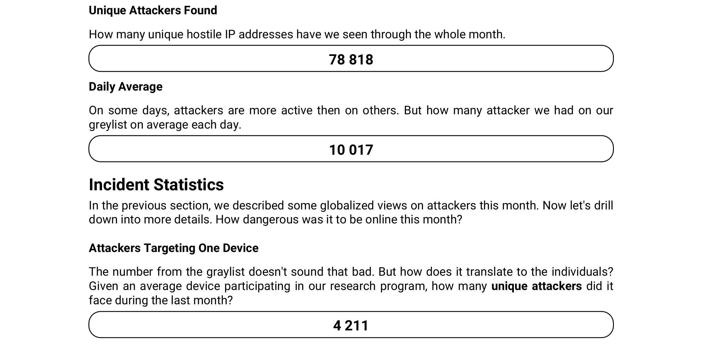
Sentinel report is divided into sections that group some related data in logical order. First is a Greylist-related couple of values. The first shows the total count of unique IP addresses throughout the whole month and the other daily average for each daily Greylist snapshot.
We run Sentinel clients on our Turris devices, which we call probes in the context of data gathering. How many unique attackers try to attack a single router endpoint on average per month? That is the first number. The second, on the other hand, shows how many probes an attacker tests on average.
The following section is the first table. There we can see the popularity of port-protocol combination counted by how many unique attackers tried it. We can also see a comparison with what the numbers were month before. Some of the combinations have a description which is a neat little bonus.
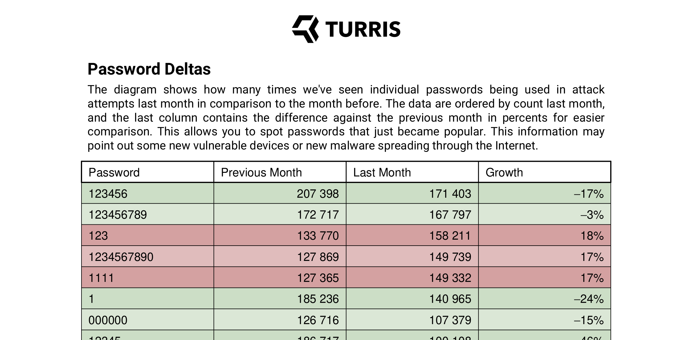
The last section with data is a table comparing the usage of passwords last month versus the month before last month.
You may ask why positives are red and negative green. Well, the colors are not misleading; given that the growth is actually a bad sign, the colors make sense.
We threw word cloud from the most used passwords to the end of the report. This makes easy to understand overview of the passwords and you can always dig into details in previous section.
What’s next?
There is still some space for improvement and we already have some ideas that are based on some internal discussions so far. We are open to any suggestions you may have. We definitely have to add graphs and some other elements that’d spice it up. You can get the first report here and we will publish further reports there as well. If you want to make sure that you don’t miss net one, you can subscribe to our sentinel-report newsletter and you will get notified once a new report is released.